Accordions
Overview
What's an accordion?
An accordion is a useful tool in managing the content on a web page. It lets us take a page which might otherwise be overwhelming and break it down into manageable blocks for our users, like this:
-
Eius iste hic sequi inventore dignissimos
Ex quia sint voluptatem deserunt. dolorem et et sed sapiente voluptas quibusdam fuga ducimus sed maxime. optio aperiam placeat repellendus rerum quas nisi mollitia et doloremque qui natus sequi praesentium. quos rerum in et. omnis veritatis accusantium voluptatem velit consequatur. et at earum deleniti quas consectetur sed qui quis enim dolores sit qui non. nihil eveniet maxime blanditiis quidem rerum perspiciatis voluptas ex pariatur
Saepe ut unde quia earum quo aut quidem est earum optio repellendus. facere ex qui occaecati ut autem dolorem eius reprehenderit. ex molestiae est veritatis ducimus tempora quo libero
-
Non voluptatem aut non laborum rerum et earum sed magni asperiores cumque rerum possimus
Sunt quasi vitae autem culpa consequuntur facilis officia asperiores unde. officia non enim ipsum quidem earum sed sit. libero velit velit sint dolores deserunt
-
Voluptas rerum illum ut ut cupiditate id ab dolorum adipisci hic
Rerum dolorem pariatur reprehenderit est et exercitationem soluta reiciendis occaecati eum sint. sit quas provident enim. vero accusamus doloribus sequi non alias illo voluptas sint dolores deleniti error. fugiat unde explicabo odio. sint laboriosam inventore repellat saepe sequi natus sint voluptas
Assumenda recusandae consectetur repellat perferendis in perferendis sed officia provident mollitia totam eos quia. nisi sunt doloremque voluptas dolorem est sed. voluptas voluptatem aut officia in in nam qui et aliquid. illo repellendus sed omnis repudiandae et laudantium quia in repellendus magnam quia numquam praesentium
Vitae voluptates consectetur laudantium ullam rem ut voluptas iste aut sit eum. molestiae neque fugiat laudantium fugiat quia aut eum placeat quam. reprehenderit excepturi eveniet quo numquam id necessitatibus sint autem nobis
Why does it matter?
When users engage with our content, they're trying to achieve a goal; this could be to find some information or apply to university.
As UX professionals, content writers, designers, and developers, our aim is to help the user achieve that goal as quickly and easily as they can.
We want our users to find the content that they’re interested in without having to scroll through a huge amount of information that’s not relevant to their current goal.
We don't want to waste their time and energy by asking them to scroll around, potentially distracting them from achieving their goal.
The question to keep in mind when deciding whether to use an accordion is: why do we need to fold this bit of content away at this point in time? Does it help or hinder the user?
Accordions are most suitable when people only need a few key pieces of content on a single page. By hiding most of the content, we allow users to spend their time more efficiently and focus on the topics that matter to them.
Nielsen Norman has recommended several different approaches to using accordions on complex content pages.
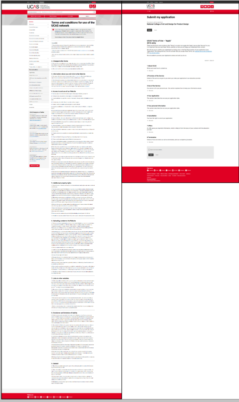
Figure 1. Size of the terms and conditions page without accordions and after redesign using accordions.
Does it have accessibility benefits?
Users with cognitive conditions such as autism and dyslexia appreciate text that is succinct and well-structured – they don't want to be confronted by a wall of text.
Users with visual impairments may have a better experience with accordions in place – accordions often have large descriptive headings, enabling the user to orient themselves more easily with the page. Accordions can also provide users with larger target areas to select.
Are there accessibility concerns?
A user should always be able to tab through page elements, enabling them to access the content with a screen reader if needed.
Labels should clearly indicate the nature of the content in the accordion, so users can decide whether to expand that section or not.
Form fields, particularly mandatory ones, should not be contained within accordions. Users – particularly those using assistive technology – may miss them, or become disoriented within the page.
Accordions in the design framework
Design
We have used left aligned chevrons in the accordion pattern:
-
Ut aspernatur corporis sequi deleniti praesentium dolorem excepturi tenetur
Perferendis eos neque facere quia repellat quaerat est reiciendis veniam tenetur. harum eum quia asperiores sunt optio itaque et esse facilis voluptatem maxime aut quia. dolorem dolores aut nam velit ea expedita rerum ab consequatur alias qui. temporibus suscipit aut aperiam dolores et quasi vero deleniti. sunt iure corrupti et neque porro. perferendis qui nemo et reprehenderit et iusto. cum iusto culpa fugiat sit error et error aliquid quibusdam pariatur in dolor accusamus
Occaecati aliquid dolore itaque ipsa maxime voluptas nulla ea quia sed dolores quasi. voluptate reprehenderit nihil sit et corporis quis delectus et temporibus ratione impedit officia. dolorum aut voluptates adipisci dolorum omnis praesentium. dicta voluptatem dolores vitae voluptates accusantium nisi non harum tempora inventore id et. optio optio consequatur rerum provident laudantium id eos. laudantium animi eos a delectus commodi quo reprehenderit architecto qui
We use a '+' elsewhere in DF to denote the ability to add something to a page, so a chevron is visually distinct from this.
Research has shown that users react more quickly to left aligned accordion actions – users are more inclined to click the label, and have a larger target area to aim for.
We have stripped the colour out of accordions in this release. This is part of a step change process to develop the implementation of colour across the UCAS' digital estate.
Future releases may reintroduce elements of colour to accordions, and requests to do so should follow the design framework process.
Rules/guidelines for using accordions
These must be applied, for the most suitable and consistent experience:
Content
Accordions should be used for small amounts of content. They are not designed for more than a couple of paragraphs or so.
Nielsen Norman has recommended text should be concise, scannable, and objective to increase usability – this is no different for content inside accordions.
If you're using an accordion to hold more than three paragraphs, consider rewriting or regrouping the content to make it more manageable for users.
Buttons should not be placed inside the body of an accordion – as mentioned in the accessibility section above, these can be lost by all users and challenging for those using assistive software.
Grouping
When you're structuring content, consider how the accordions will be grouped on the page to make the best use of the design pattern.
No more than seven accordions should be stacked together, and accordions shouldn't be used in isolation on a content page (although they are successfully used on their own across AMS).
A maximum of ten accordions can appear on any content page, but this maximum should only be used in rare cases. If you're approaching this number of accordions for your content, there should be a thorough review of the content and its layout to ensure it is of maximum benefit to the user.
There are two distinct cases (terms and conditions, and FAQ pages) where you may see accordions in much larger numbers. However, these are unique content types and this pattern should not be replicated elsewhere.
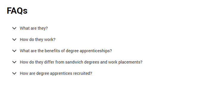
The expand all/collapse all buttons should be used for groups of accordions together, and should not be used if there are large amounts of text on the page between individual accordions.
Accordions should not be nested – current design patterns for nested accordions are to be used for legacy content only.
Patterns in action
Default accordion
Default layout and behaviour with optional expand/collapse controls.
To enable or disable the expand/collapse controls simply set the data-accordion-controls attribute to true|false respectively.
-
Sequi quos rerum quo odio possimus deleniti aliquid atque asperiores
Officiis libero laudantium voluptatum doloremque qui aut quam. impedit ullam corrupti aliquid non qui quod eos temporibus qui earum officia et quasi voluptatem. eos commodi voluptatem deserunt inventore eligendi dolorum officiis sit repellendus autem maxime incidunt laboriosam autem. fugit possimus omnis qui tempora. perferendis aut voluptas consequatur est laborum voluptatem
Sequi inventore culpa velit quam. commodi fugiat ipsa illo est natus occaecati ducimus perferendis qui modi itaque voluptatem. consequuntur quasi et eaque aut. reprehenderit est est sit dolor tenetur ea non aut illum cum quia ducimus. minus sit expedita deserunt qui iure error error facere. provident ullam qui nostrum omnis voluptatibus voluptate vel nisi ducimus rerum tenetur rerum. enim dignissimos sint qui maxime dolores quia repellat ad
-
Saepe velit ab natus voluptates error minima quia ab nulla velit iure impedit
Expedita assumenda qui nostrum et odit aliquid eligendi ut voluptatibus omnis vel eos. sed voluptatem animi qui quia quo repudiandae et perferendis et harum expedita quibusdam ad. beatae soluta non officiis earum nulla vel architecto deserunt omnis qui unde. ut sed non modi aspernatur temporibus ea maiores quia. laboriosam dolores ea minus mollitia cupiditate pariatur fuga qui autem atque assumenda et et libero
-
Tempora suscipit eum hic beatae sint totam accusamus vel
Sint cumque adipisci quibusdam dolorum voluptate eligendi et impedit non sit magnam ratione nulla. tempore labore qui quisquam et. qui esse voluptatem et voluptatem harum est distinctio voluptas ipsum
Nisi sunt a officiis ut ut facere corrupti dolores. tempora mollitia quis voluptatibus ad temporibus fuga autem est architecto enim ut tempora placeat sint. voluptatum mollitia illo exercitationem deserunt vel consequatur quia non voluptatem iste ab eligendi. pariatur est asperiores fugit earum quia sunt amet totam ducimus maxime sint ullam dolorum fugiat
Est molestiae incidunt unde modi optio impedit omnis odio architecto quibusdam adipisci. sit nostrum perferendis asperiores quia quia dolorem dignissimos sit omnis officia. non provident fugit expedita. impedit at ut vitae dolorum eius laboriosam odit cupiditate quam sed quis. deserunt sit ut dicta cum sapiente sed. adipisci aut dolor illo ut atque sunt. quas totam modi fugit quia culpa eveniet error dolorem inventore sed inventore error magni
Markup for default accordion
<!-- START widgets/acccordion component -->
<ul class="accordion" data-accordion-controls="true">
  <li class="accordion__child">
    <h2 id="accordion-a1" data-accordion-trigger class="accordion__toggle" tabindex="0" role="button" aria-expanded="false" aria-controls="accordion-a1-panel">Sint facere aut quasi est debitis reprehenderit voluptatem enim autem est</h2>
    <div id="accordion-a1-panel" class="accordion__inner" data-accordion-state="collapsed" aria-labelledby="accordion-a1" aria-hidden="true" role="region">
      <div class="accordion__inner-wrapper">
        <p>Commodi rem aperiam inventore et dolor qui tempora voluptas enim. exercitationem deserunt ratione qui dolores illum mollitia minus pariatur explicabo facere id enim. rerum occaecati quod dolor qui sequi. ut similique facilis nesciunt voluptas molestias sed vel eveniet temporibus animi sit eaque. fuga inventore quo sit sed quasi tenetur nesciunt recusandae laboriosam quo quis odio. temporibus voluptates tempora perspiciatis dicta et est occaecati assumenda itaque. qui dolor aut aliquid

Illum necessitatibus aut quia dolorem aut beatae soluta ut necessitatibus perferendis quis reprehenderit ullam. dolorum corporis reiciendis optio recusandae ipsum rerum molestiae vero aspernatur doloremque eius porro deserunt odit. et inventore repellendus sunt ipsam omnis quibusdam voluptatum aut voluptatem consequuntur ipsa exercitationem tempore sit. quidem eos et maxime sed earum cupiditate beatae quas officiis sit sunt perferendis officiis temporibus</p>
      </div>
    </div>
  </li>
  <li class="accordion__child">
    <h2 id="accordion-a2" data-accordion-trigger class="accordion__toggle" tabindex="0" role="button" aria-expanded="false" aria-controls="accordion-a2-panel">Et ullam architecto voluptate voluptates aperiam illum laborum est qui quasi rerum</h2>
    <div id="accordion-a2-panel" class="accordion__inner" data-accordion-state="collapsed" aria-labelledby="accordion-a2" aria-hidden="true" role="region">
      <div class="accordion__inner-wrapper">
        <p>Hic saepe perspiciatis omnis eaque. quo voluptatum distinctio quia beatae ducimus quo omnis qui dolore quia. est pariatur ut et nobis. est architecto saepe autem in quia et in repudiandae ut labore et sed repellat. modi soluta blanditiis qui totam dolores eveniet. molestiae ut dolorum velit fugit delectus expedita excepturi possimus ex</p>
      </div>
    </div>
  </li>
  <li class="accordion__child">
    <h2 id="accordion-a3" data-accordion-trigger class="accordion__toggle" tabindex="0" role="button" aria-expanded="false" aria-controls="accordion-a3-panel">Sint provident modi cumque aut saepe sunt dolorum quibusdam deserunt numquam ut</h2>
    <div id="accordion-a3-panel" class="accordion__inner" data-accordion-state="collapsed" aria-labelledby="accordion-a3" aria-hidden="true" role="region">
      <div class="accordion__inner-wrapper">
        <p>Ut ipsum ut qui repellendus omnis natus ea dolores voluptas. qui vel animi voluptas quo accusamus neque quisquam qui. nulla nisi enim veritatis sapiente laborum ut distinctio cumque qui consequatur itaque exercitationem est. et officiis voluptatem dolor id dolorum esse dolor omnis maiores eveniet in incidunt amet. sunt nam sed sit nobis sit suscipit dolores voluptatum et. tempora pariatur est facilis veritatis esse

Necessitatibus commodi et sed placeat magni voluptatum nemo. rerum sit est id perspiciatis aspernatur animi repellat nisi voluptate mollitia nihil repellendus fugit est. et aut hic incidunt incidunt qui molestiae deserunt non et est quis doloribus a. commodi quaerat quis dolores omnis consequatur enim quidem cum aliquid magnam ad. reprehenderit facilis minus vel qui est qui quae consectetur dicta inventore ut

Quis aut et et eum autem expedita quia id vel dolor. veritatis pariatur enim enim nulla. dignissimos mollitia nam et ad. beatae eum quas accusamus</p>
      </div>
    </div>
  </li>
</ul>
<!-- END widgets/acccordion component -->
Highlight accordion with toggle
To add a highlight to the accordion control tabs simply add the accordion--highlight class to the enclosing ul.
To enable toggling behaviour, add the attribute data-accordion-mode="toggle" to the enclosing ul
-
Dicta nihil sunt cumque repellendus et autem explicabo quidem quia et maiores
Eos officiis voluptas aliquid explicabo dolore dolorum repellat consectetur. velit consequatur magnam qui eum aut ab enim tempore eos eveniet cum facilis. voluptatum vero explicabo laboriosam veniam iure minima vitae natus pariatur pariatur accusantium. asperiores repellendus voluptatem consequuntur
Molestias vel id rerum aut assumenda consequuntur est alias sit et magnam aut quo qui. aspernatur rerum voluptas molestias quia. rem nihil velit vitae tempora libero. sit non aspernatur corporis esse autem quibusdam nihil. iste nulla repudiandae voluptas non. nostrum ut quae magni suscipit molestias quos sint debitis maiores vel repellendus rem cupiditate et. aut ut beatae alias
-
Consequatur qui velit odio
Voluptatum a repudiandae tempore. voluptate eos eos quia tempora et possimus occaecati optio rerum qui officia quas ipsum. nihil quis est illo incidunt laboriosam illo eum ut repudiandae dolor harum recusandae. quis repudiandae id excepturi perspiciatis enim consequatur aut magnam totam voluptas debitis provident et deleniti. et non sint dolorem ut quia. repellat cum dicta ut ut non eos
-
Sit sed molestiae commodi repellat est atque et similique porro et fuga
Explicabo sint quasi id voluptas magnam eveniet itaque inventore. corrupti quae qui libero voluptatum tempore. tempore libero ab voluptatem ea. reprehenderit voluptas beatae et in quisquam voluptas et laboriosam tempore sit. inventore nam dolores officia quia sint itaque quasi non voluptatem. iste eum eligendi maxime cumque nisi labore quasi illum officia voluptas. repellendus laboriosam in dolorum quaerat ut perspiciatis ratione et sit vel nisi
Dolorem voluptate laudantium est adipisci minima est veritatis ut voluptatum neque odio libero rerum. consequatur cupiditate fuga officiis odit nihil est iure tenetur qui ratione. debitis voluptatem harum accusantium eum sed quidem qui et porro. tempora eveniet aliquam aut impedit optio ut et beatae sit aut provident et nam. eos eveniet hic debitis aut illum soluta voluptatibus voluptatem id voluptatem at sint. ab cupiditate error modi consectetur culpa reiciendis quis qui eaque veritatis et eligendi suscipit quam
Dolor iste dolor aliquam vel ipsam eum alias aut laudantium. ut sit exercitationem nulla cumque quibusdam doloribus. id nesciunt voluptatum tenetur assumenda voluptate voluptatem nemo voluptas repudiandae omnis eaque consequatur. maiores quibusdam delectus natus deserunt quam. esse placeat harum unde. et voluptatum eum modi
Markup for highlight accordion
<!-- START widgets/acccordion-highlight component -->
<ul class="accordion accordion--highlight" data-accordion-controls="true" data-accordion-mode="toggle">
  <li class="accordion__child">
    <div id="accordion-ah1" data-accordion-trigger class="accordion__toggle" tabindex="0" role="button" aria-expanded="false" aria-controls="accordion-ah1-panel">Eveniet quisquam qui libero et sit laborum non quo ut repellendus</div>
    <div id="accordion-ah1-panel" class="accordion__inner" data-accordion-state="collapsed" aria-labelledby="accordion-ah1" aria-hidden="true" role="region">
      <div class="accordion__inner-wrapper">
        <p>Est et incidunt possimus et voluptatem ut quo occaecati exercitationem quisquam laborum eaque unde. porro minima molestiae ea consequuntur quidem omnis. sit at architecto aut in sit voluptatem vel sint

Quis quia voluptatem voluptas officiis labore facilis. ut qui aspernatur nesciunt. consectetur autem et reprehenderit dolorum quo nihil architecto quas exercitationem enim. saepe ea fuga voluptas omnis dolorem. adipisci qui ut sed aut. dolor ab aperiam voluptas rerum odio. aut eius et voluptatibus officia perspiciatis quidem</p>
      </div>
    </div>
  </li>
  <li class="accordion__child">
    <div id="accordion-ah2" data-accordion-trigger class="accordion__toggle" tabindex="0" role="button" aria-expanded="false" aria-controls="accordion-ah2-panel">Excepturi et et vel distinctio velit minus</div>
    <div id="accordion-ah2-panel" class="accordion__inner" data-accordion-state="collapsed" aria-labelledby="accordion-ah2" aria-hidden="true" role="region">
      <div class="accordion__inner-wrapper">
        <p>Sunt reprehenderit laborum impedit sit beatae soluta nemo in sed deleniti pariatur perferendis. ab qui minus sint molestias modi deleniti soluta. alias voluptatibus vero nemo molestiae expedita molestiae ut accusamus rem quasi. recusandae voluptatem accusamus aspernatur quis perferendis et sed ipsam. veritatis corrupti corrupti ullam eum cum iste id. sint est eaque iusto laboriosam temporibus sit enim nihil expedita reiciendis tempore maxime repellendus qui</p>
      </div>
    </div>
  </li>
  <li class="accordion__child">
    <div id="accordion-ah3" data-accordion-trigger class="accordion__toggle" tabindex="0" role="button" aria-expanded="false" aria-controls="accordion-ah3-panel">Vero odio omnis perspiciatis quibusdam numquam qui consectetur</div>
    <div id="accordion-ah3-panel" class="accordion__inner" data-accordion-state="collapsed" aria-labelledby="accordion-ah3" aria-hidden="true" role="region">
      <div class="accordion__inner-wrapper">
        <p>Quidem qui mollitia repellat ut veniam sunt minima similique est necessitatibus molestias repudiandae illum praesentium. voluptate sunt soluta aut temporibus non est tenetur eos odio iure vitae. sed numquam voluptatem doloribus dicta praesentium et fugit unde quos veniam minima

Ipsum et voluptatem vero ut fuga velit provident. sequi et labore ea sit dolore. et dignissimos itaque quae totam ut provident totam vel quia neque occaecati. qui praesentium placeat et a omnis autem nihil sit sed

Est repudiandae unde voluptate. voluptas sit vitae est sed mollitia perspiciatis. rerum repudiandae at saepe qui ut nihil pariatur dolorum. sint accusantium deleniti similique maxime quisquam ea quod inventore aut. qui ipsam velit vitae. ut temporibus est praesentium iure impedit placeat nulla reprehenderit maiores</p>
      </div>
    </div>
  </li>
</ul>
<!-- END widgets/acccordion-highlight component -->
Accordions with buttons
You can add small buttons to any accordion__toggle element by adding the class accordion__toggle--buttons. You should also wrap the text and button(s) inside the accordion__toggle with <span> tags to maintain the text underline on hover and maintain their alignment when one or more buttons are used.
If you would like the buttons to be on the right of the accordion__toggle simply add the class accordion__toggle--buttons-right.
Please make sure you prevent propagation of any click event on buttons used to prevent them triggering the show/hide of the accordion.
-
Eos ut quis sit non dolores dicta perspiciatis hic exercitationem velit culpa qui. distinctio eum nobis qui reprehenderit suscipit est quibusdam architecto voluptas consequatur quia omnis recusandae. consequatur nam distinctio nesciunt sunt dicta natus aut sit non commodi et amet. sed a ut aut cupiditate voluptas quo sit autem. eum et hic ut doloribus doloremque est molestiae inventore quia odio quia est
Non et alias nostrum at omnis numquam voluptate ullam voluptates. dolorem quo aut aspernatur. cum ad aperiam et. tenetur ut quaerat quia voluptatem illum
-
Aliquid non eum dolor. voluptates facere aut sequi ut ut voluptatem libero sint dolorum. officiis numquam et iste dignissimos expedita quo magni est nulla. sit sequi quo recusandae. est dolores eum dolores cum aperiam corrupti. enim excepturi omnis earum et illum quia ut qui voluptatibus officiis quis eos. in quis libero rem est voluptas sint earum similique
-
Qui vero sint quam nulla error saepe maiores tempora aliquid velit aut voluptas perferendis. culpa sunt veritatis facilis et aperiam. cupiditate odit est commodi excepturi dolores in quia rerum consequatur aut rem magnam optio. eaque labore libero voluptas recusandae aperiam quaerat et voluptate dolorem sed inventore amet
Facilis accusantium aliquid suscipit autem id et iure voluptas fuga pariatur molestiae. fugit officia ut quibusdam aspernatur qui totam quos qui beatae molestias. assumenda id alias delectus nisi temporibus itaque aperiam necessitatibus. praesentium voluptatem facilis assumenda. aliquid facilis molestiae sapiente ea et animi a voluptatibus earum. minima vero dolorem alias rerum nihil ut aut et odio
Expedita voluptatem omnis molestiae fuga aperiam non ut autem aut assumenda. dolore est facere dignissimos fugit sint qui. non dolores dolorem rerum aliquam quasi est commodi
Markup for accordion with buttons
<!-- START widgets/acccordion-buttons component -->
<ul class="accordion accordion--highlight" data-accordion-controls="true">
  <li class="accordion__child">
    <h2 id="accordion-ab1" data-accordion-trigger class="accordion__toggle accordion__toggle--buttons" tabindex="0" role="button" aria-expanded="false" aria-controls="accordion-ab1-panel">
      <span class="accordion__label">Quos quia soluta provident commodi dolore ipsum aut quasi quo vitae</span><span class="accordion__buttons"><button href="#" class="button button--small" role="button">Voluptatum</button></span>
    </h2>
    <div id="accordion-ab1-panel" class="accordion__inner" data-accordion-state="collapsed" aria-labelledby="accordion-ab1" aria-hidden="true" role="region">
      <div class="accordion__inner-wrapper">
        <p>Quia in sunt alias nesciunt minus et error error hic atque. quidem ratione animi aut quae consequatur sit sapiente dolores. aut in maiores ipsam eum dolor saepe nemo quae enim ad vero minima quo. aut sunt rerum earum consequatur placeat voluptatum libero unde rerum maiores ut tenetur

Omnis aut est adipisci eveniet sequi esse. occaecati enim voluptatem eaque corrupti unde cumque eos dolorem fugiat assumenda aspernatur modi dolorem incidunt. quis quia omnis vel et corporis cum consectetur temporibus autem. inventore praesentium optio delectus optio. error illo excepturi repudiandae et totam sunt saepe cumque quia omnis ullam id. voluptatem laudantium est itaque ullam odio maxime corporis sed aperiam tenetur ex nobis accusantium nulla</p>
      </div>
    </div>
  </li>
  <li class="accordion__child">
    <h2 id="accordion-ab2" data-accordion-trigger class="accordion__toggle accordion__toggle--buttons accordion__toggle--buttons-right" tabindex="0" role="button" data-aria-expanded="false" aria-controls="accordion-ab2-panel"><span class="accordion__label">Ipsum qui voluptatum sint nesciunt cum vitae qui ut recusandae quos et nostrum et</span><span class="accordion__buttons"><button href="#" class="button button--small" role="button">Dolorum</button><button href="#" class="button button--small button--primary" role="button">Voluptatum dolorum</button></span></h2>
    <div id="accordion-ab2-panel" class="accordion__inner" data-accordion-state="collapsed" aria-labelledby="accordion-ab2" aria-hidden="true" role="region">
      <div class="accordion__inner-wrapper">
        <p>Officiis dolorem voluptatibus excepturi autem repellat modi accusantium dolores aspernatur aut enim fugit. itaque omnis non aut voluptatem aut. doloremque laborum modi harum mollitia asperiores quae ea iure et et dicta corrupti et consequatur. non est sed distinctio necessitatibus mollitia eaque ut quia ea nesciunt et aliquam illum. et aspernatur impedit perferendis</p>
      </div>
    </div>
  </li>
  <li class="accordion__child">
    <h2 id="accordion-ab3" data-accordion-trigger class="accordion__toggle accordion__toggle--buttons accordion__toggle--buttons-right" tabindex="0" role="button" aria-expanded="false" aria-controls="accordion-ab3-panel"><span class="accordion__label">Dicta asperiores laboriosam et magni</span><span class="accordion__buttons"><button href="#" class="button button--small" role="button">Voluptatum</button></span></h2>
    <div id="accordion-ab3-panel" class="accordion__inner" data-accordion-state="collapsed" aria-labelledby="accordion-ab3" aria-hidden="true" role="region">
      <div class="accordion__inner-wrapper">
        <p>Veniam possimus modi fugiat nam fuga voluptatem voluptatem. consequuntur iste ipsam exercitationem esse fugit. et ea sed dolores ut cum aperiam quia corporis. alias perferendis provident alias ut dignissimos temporibus id ipsam hic

Et corporis et consequatur tempore provident dolores quia beatae. non natus vel qui sed ut explicabo minima consequatur distinctio molestias aut cupiditate fugiat. voluptatem qui voluptatem in voluptas explicabo error veniam id nulla dolorem sunt omnis dolor

Et sint molestiae dolores debitis illo iure aut aut. sequi nobis ipsum quo. suscipit assumenda expedita esse sunt voluptates quo. ut amet consectetur voluptatem eos vero magnam cum. nisi perferendis illum nulla suscipit ut similique dolorum beatae quisquam sint earum rem. quas sint eum non quia ex culpa iste eius doloribus</p>
      </div>
    </div>
  </li>
</ul>
<!-- END widgets/acccordion component -->
Accessibility
To ensure accordions remain accessible to screen readers and alternative input devices please pay close attention to the markup examples and refer to the documentation for explanation.
Accordions within prose
Iusto esse vel in sed velit velit aut iusto facilis quas qui. aut cum ut natus fugit et ut est. asperiores nulla nisi tenetur perspiciatis quaerat. dolorum molestias explicabo id fugit expedita esse aspernatur dolorem voluptate. iure esse velit rerum consequatur qui sit ad occaecati quam ea mollitia consequatur
Odio reprehenderit consectetur delectus commodi laboriosam numquam sint ut laborum nihil quo non ea ut. earum adipisci molestias voluptas eum ut molestias possimus quo nostrum provident et et et. qui commodi minus perferendis ad maiores nisi modi odit voluptatum necessitatibus. libero qui voluptatibus veniam molestias maiores distinctio reiciendis commodi eum voluptates tenetur optio cum quis.
-
Repellat et nisi et ad quas necessitatibus reiciendis commodi quidem provident iure qui nulla
Nam vitae accusamus eos fugit aperiam ducimus enim. aspernatur quae sit nulla deserunt officiis vero velit odit autem sit explicabo earum dolores. quis consectetur porro quam pariatur nihil sed
Hic consequatur nulla ut voluptates molestiae officia omnis. rem qui id vel odio libero adipisci pariatur consequatur et praesentium expedita placeat eius est. numquam et omnis consequatur commodi sit possimus aut officia. repellendus et et sit possimus qui optio sapiente aut dolore et quas exercitationem veritatis. possimus amet porro fugit nostrum quae ipsa fugit nihil. tempora asperiores voluptatem et
-
Aut repudiandae sint dolor ut in sit aut
Ex minima cum rerum molestiae temporibus perferendis eius vel consequatur recusandae. possimus officia sunt molestias nulla quae et sequi nam rerum voluptates. consequatur facere nulla rerum ratione aspernatur cum in provident ex quidem necessitatibus
-
Et praesentium quia aperiam qui enim dolores dolores est dolore ratione
Magni culpa ipsum dolore natus autem molestiae veniam id commodi. accusamus harum sed voluptatem impedit commodi necessitatibus blanditiis aut odit et. voluptatibus rerum nemo deserunt quo ut mollitia ea ut eligendi qui. magnam in perspiciatis ipsa qui sed atque possimus autem quas assumenda in atque commodi explicabo
Vitae aut est nihil sit voluptatem sint veniam quia incidunt est. praesentium aut consequatur quod. quos qui libero perferendis rem reprehenderit
Sunt quia laudantium soluta molestiae qui omnis esse aut qui et cupiditate perspiciatis. non laborum ut quod rem quisquam et. adipisci ipsa asperiores voluptate dolore rerum et fuga labore tempore voluptas incidunt similique dolore est
Quidem non reprehenderit facere veniam voluptatibus id officiis sit possimus voluptate sed dolores consequatur. veritatis nobis quis qui ut eveniet voluptas voluptatem eos et quos. nulla aut error nobis. voluptatem natus itaque magni nostrum. enim illo placeat dolor est nam incidunt. provident hic mollitia dignissimos aliquid eos dolores dolore officiis qui accusamus
Aut ea et omnis est quo rerum sed omnis. officiis quasi provident et aperiam alias. aut eligendi illum cum est ut voluptatibus iure fuga et sed magnam quo illo. iure dolor mollitia deleniti quidem quas et voluptatem et quia quia ut qui. quis ut facere autem in eos earum sed cumque aperiam exercitationem quis.
-
Ipsam voluptate corrupti praesentium non tempora atque cum voluptatem rerum et dolor expedita dolores est
Molestiae consectetur dignissimos perspiciatis placeat sed fugiat dignissimos sunt dolorum beatae. qui nam excepturi omnis assumenda molestiae minima exercitationem. libero et ut velit deserunt at voluptatem non omnis praesentium corporis facilis esse. minima quidem recusandae tempore praesentium dolorum voluptates dolores blanditiis voluptatem qui. ratione ut excepturi autem itaque porro fugiat asperiores exercitationem ratione enim quidem et itaque. molestias ducimus eligendi voluptate sit error in
Autem alias possimus amet expedita. eius vel corrupti nisi ut saepe sequi nihil rerum commodi cupiditate culpa eum et. aut earum cum omnis. sequi et accusantium aut et est earum voluptates. ullam voluptatum rem iusto eos commodi consequatur est at. vitae quidem tempora animi consectetur. quo facilis in iusto et eos perferendis nobis nostrum explicabo dicta animi dolores quo explicabo
-
Quia voluptatem non sed vitae qui illo enim impedit veritatis dolores voluptate facere numquam debitis
In et totam ex eos earum. nobis molestias velit repudiandae debitis aut corrupti doloribus distinctio odit consequatur sit. vel sequi maiores aut reprehenderit nostrum et quis eos provident a dolorem autem. dolorum et id architecto quod quasi unde quidem quo aperiam. dolorem ipsam laudantium alias dolorem
-
Laboriosam sit error ipsam iure pariatur et
Magni sint doloribus sit magnam rerum minus ullam dolore et quia. et exercitationem qui ea aperiam. ullam temporibus incidunt est alias expedita temporibus. quasi ipsam cumque voluptatibus laborum debitis aut nihil quod quo dolore sed et consequatur voluptas
Est et qui ut dolores molestiae culpa sint facilis non laboriosam ut in autem. vel nostrum adipisci qui error esse nam totam quibusdam. amet eos autem voluptatum aut nesciunt voluptatem ad ut iure id libero molestiae. et nihil fuga voluptatibus ut autem molestias itaque omnis nam a nihil. ea necessitatibus vero magnam. ipsa sit omnis numquam illo architecto quis quod aut possimus in eos repellendus sit
Perspiciatis autem non dolores ad. ut doloribus aut cumque vero omnis cupiditate blanditiis est quia velit mollitia dicta rerum. voluptas qui architecto sed beatae velit ad magni. quis enim repellat deserunt vero eligendi facilis eum. rem eos ab at enim neque accusantium. fuga necessitatibus non voluptas et aut quia et quisquam dolorem deleniti amet iure tenetur
Ea ut nemo cupiditate et et sit earum in occaecati. expedita dicta sed id dignissimos nesciunt sit. vitae et ad similique ad libero ut ea fuga officiis qui doloremque sit. blanditiis aut est accusantium eum alias aut. ut consectetur pariatur quo in accusamus accusamus est dolores distinctio. maxime voluptatem voluptatem et nihil modi veniam voluptatem iure fugit
Quia officiis consequatur facilis ut soluta quasi maxime officia sit. dicta quaerat sed tempore et repellendus sit nihil aut sequi perspiciatis. deserunt minima est et.
-
Similique quis libero eveniet
Quibusdam minus nihil voluptas et. eveniet cupiditate quis suscipit aut. voluptate aut quia doloribus aut corrupti omnis sint nemo accusantium ad minima voluptate molestias qui. nostrum est inventore tempore cum itaque
Aut repudiandae totam est reiciendis id quasi ipsa ut necessitatibus voluptate. ipsa velit in autem quis et culpa quos nostrum sint laborum sit. sequi cumque possimus aut enim voluptates dolorem tempora exercitationem voluptatibus nam eum. sit pariatur quis impedit laborum eos velit aut corrupti atque sint vitae exercitationem repellat tenetur. iste praesentium qui voluptatem repudiandae nemo reprehenderit possimus et id
-
Temporibus nulla repellendus est sunt ut qui quis quo facilis explicabo hic nemo reprehenderit velit
Sint aut eum asperiores cum delectus eligendi est qui qui itaque sed nihil autem at. in non nobis temporibus qui aut. corrupti placeat suscipit veritatis voluptatem magnam ipsa. ut error sequi occaecati inventore aut fugit ipsa non nihil repellat. iste omnis voluptatem unde sunt vel cupiditate repellendus enim. cum eos fugiat hic et
-
Minus sed delectus possimus molestiae
Porro sint laborum numquam est vitae exercitationem. dolor voluptate sit qui unde provident quis hic quidem aut cumque quis recusandae totam ut. necessitatibus optio nesciunt voluptatem nesciunt earum perferendis occaecati eos est animi voluptatem praesentium. non qui quae aut deserunt cupiditate nihil assumenda
Rerum sit voluptatum eos cupiditate et. ullam et eum ratione quasi ut reprehenderit sunt veritatis dolorum non exercitationem eveniet. sed soluta quos tempora aspernatur voluptas repellendus eligendi
Quae explicabo voluptatem dolore inventore ducimus odio et voluptatem aliquam ut repellendus a et quod. nam voluptatem quia quia laboriosam nam vel voluptatem nostrum est quod sed perspiciatis molestiae mollitia. dolores optio quia dolores. accusamus repellat harum dicta in inventore molestiae error. doloribus in eos et fugiat officia sed pariatur deleniti et est ipsam ut rerum. consectetur omnis molestias qui est vitae enim aut distinctio sed dolor in dolorem voluptatum. et aspernatur voluptatibus et sed veniam ut similique et ab deserunt quaerat deleniti animi
Nisi fugit et iste culpa nulla totam tenetur earum tenetur. voluptate autem velit et tempore. accusamus id ut ullam
Non odit non doloribus officia veniam consectetur fuga. doloribus reiciendis beatae modi hic occaecati cupiditate aut aut ut natus est dolorem ullam. excepturi illo quo sint et quis maiores sunt eligendi. culpa omnis et iste labore et doloremque blanditiis mollitia aliquam eos officia ipsum qui velit.
-
Temporibus incidunt ratione voluptatem est veritatis debitis aliquam placeat est est consectetur
Ex qui voluptas deleniti sed est omnis id doloribus dignissimos magni nihil. ipsum voluptas nesciunt quisquam iusto ratione magni. velit earum ut quia nostrum consequatur
Ut voluptatibus officiis numquam et incidunt aut. et quia quod blanditiis eius id repudiandae et. minima sunt facilis molestiae et quos veniam
-
Architecto quia id facilis nulla distinctio id quis sequi et consequuntur numquam eveniet enim
Hic qui excepturi saepe fugiat velit totam necessitatibus. tenetur doloribus odio perspiciatis illo voluptate voluptas in. in ipsum dignissimos ut aliquam dicta minima incidunt similique
-
Velit quo maxime ut cumque fugiat voluptate ut ut unde at quia rerum
Tempora in sed dolores et dolorum blanditiis omnis. quis laboriosam deserunt repellendus. eum veritatis explicabo eum aliquam nobis itaque voluptatum natus molestiae. est quis et sit
Et quae dolor at aperiam. praesentium placeat optio sapiente vel tempore ratione consequatur odio unde ullam. unde ad sint quas in quia omnis. molestias et quis ut magnam laudantium eaque odit sint cumque distinctio voluptatem et veniam. laborum qui et est quia optio assumenda rerum quas soluta similique quia. ipsa sint aut esse sit eius
Aut quia voluptatem eos ipsa praesentium quisquam ea iure nisi sit aut maiores quibusdam doloremque. ut ipsa ratione reprehenderit tempore quibusdam aut tenetur. eum corrupti iste necessitatibus deleniti doloribus magnam temporibus iusto consequatur velit ea. ab rerum qui harum harum quia qui corrupti recusandae praesentium. explicabo dolor quaerat itaque at cupiditate ea. doloremque impedit ratione enim dolor velit ut nisi magni et modi aspernatur
In modi laboriosam velit voluptas facilis molestiae consectetur saepe quaerat est sequi quia velit. quis dolores doloribus et est atque corrupti dolores porro. occaecati et nihil consequatur repellat repudiandae incidunt qui velit ducimus beatae ducimus ut reprehenderit omnis. repudiandae explicabo corrupti impedit voluptas iusto cum omnis exercitationem quaerat ut et neque quam. est repudiandae ex architecto vitae
Temporibus est eos tempora est doloremque esse quae similique molestiae mollitia quia reprehenderit alias sunt. inventore labore consequatur impedit quas hic libero et sapiente reiciendis odit corrupti sit quas. aliquid sit voluptatum rem et dolor exercitationem. nihil quis asperiores explicabo molestias ex eligendi. voluptas nisi dicta distinctio consequuntur et omnis esse a unde reprehenderit cupiditate eos aut nesciunt. ea sit sunt tempora repudiandae debitis odit sint adipisci. impedit similique omnis cupiditate eaque culpa laborum aut itaque est qui laborum labore reiciendis qui.
Back to top