Creating a custom seatmap SVG file
To fully unlock the potential of seatcurve you will need to create a custom seatmap SVG file, the following documentation will guide you through this process.
Creating A New Seat-map Graphic
In order to use a custom seat-map design you need to provide a seat-map graphic as an SVG. These graphics can be created using Adobe Illustrator. This document assumes you are using Illustrator CC.
Exporting An Initial Seat-map
To get you started SeatCurve will provide an initial seat-map to work from. The default behaviour of SeatCurve is to generate a basic seat-map when no custom graphic is provided:
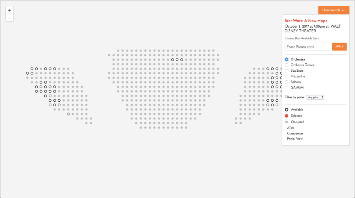
This graphic is generated based on the raw-Tessitura coordinates. Maps are broken down into screens. In fact, if you are familiar with the inbuilt seat map tool in the Tessitura client then this output should look familiar to you as these generated mappings use the same underlying data so are pretty much a 1-to-1 mappings.
We use these generated seat-maps to provide a starting point for custom seat-map graphics. The way we generate these starter graphics is to export the generated markup from the page and save it as a flat SVG graphic. This can be done using most browser development tools by inspecting the page, and right clicking on the seat-map SVG.
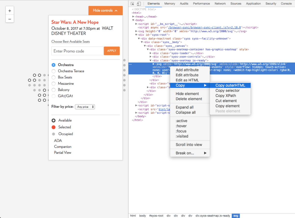
Once you’ve saved this markup as as an SVG you can import it into Illustrator for editing:
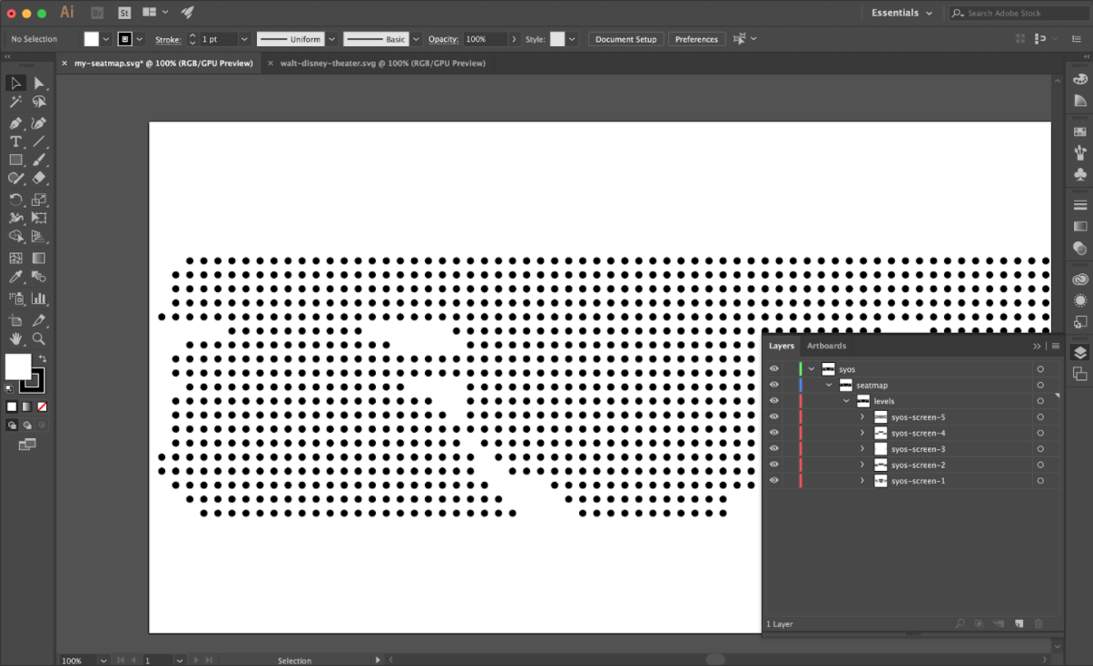
Seat-map Structure
There are a few key rules to follow when structuring your seat-map:
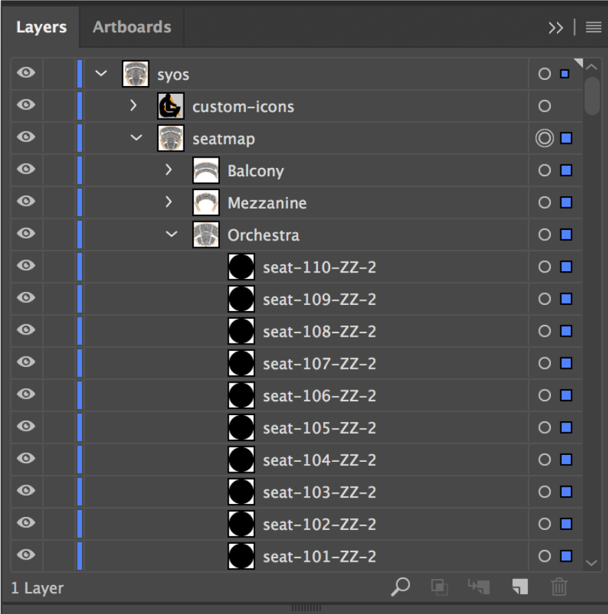
Top-level Layer
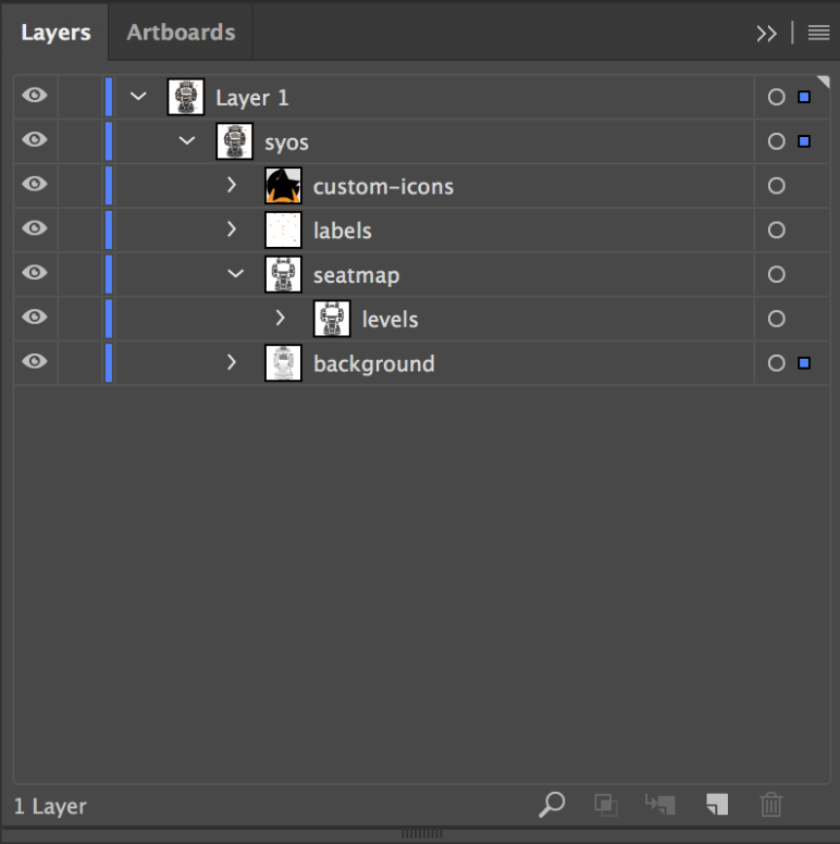
The top-level layer must always be named “syos”.
Second-level Layers
For the second-level of layers, there are two main requirements. Firstly, the main layer must be named “seatmap”, this is where all your seats go. Secondly, you can also provide a layer for custom-icons which must be labeled ”custom-icons”.
For the venue background illustrations (section outlines / seat markers / labels etc.) you can either place them in the dedicated layer at the second-level or place them in layers inside the “seatmap” layer.
Third-level Layers
The third-level of layers is used to define individual levels. You have two main options here:
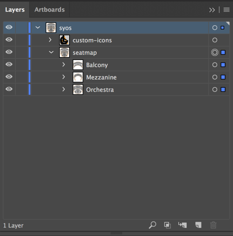
Overhangs: If you are working on a venue that has notable overhangs then you can create multiple layers in here to create clickable areas within the seatmap. The layer names match how you’d like them to be described in the UI, e.g. “Balcony” or “Orchestra”.
Flat-levels: If you are working on a venue that is simpler, or where any overhangs can be represented as a single flat seat map then you will want to create a single additional layer under the “seatmap” layer named “levels”.
Additional Layers
Once you’ve got down to the seat level the grouping is up to you. You can either leave them flat, group them by screen, by section, or any other grouping that makes sense for your organisational purposes. The only requirement is that all layer names are labelled like HTML IDs i.e. In that they should not contain any spaces or special characters.
Seat Naming
Individual seats are already named for you in the starter graphic. It’s still useful to understand how the seats are named so you can accurately match them up when moving seats around in your graphic.
Seats are named in the format “seat-{num}-{row}-{screen}-{section}”. These values match up to the following Tessitura data:
- num value is the physical seat-number
- row is the physical row number or letter
- screen is the internal Tessitura screen ID. This often needs looking up in the API to understand what the IDs match up to.
- section is the internal Tessitura section ID. As with the screen ID this often needs looking up in the API to understand what the IDs match up to. Section is optional but useful for disambiguation in cases where the same seat number and row appears within the same screen.
For example, if we have the seat “Seat 10, Row C, Screen 2, Section 17” the seat format would be seat-10-c-2-17.
Exporting Seat-map Graphics
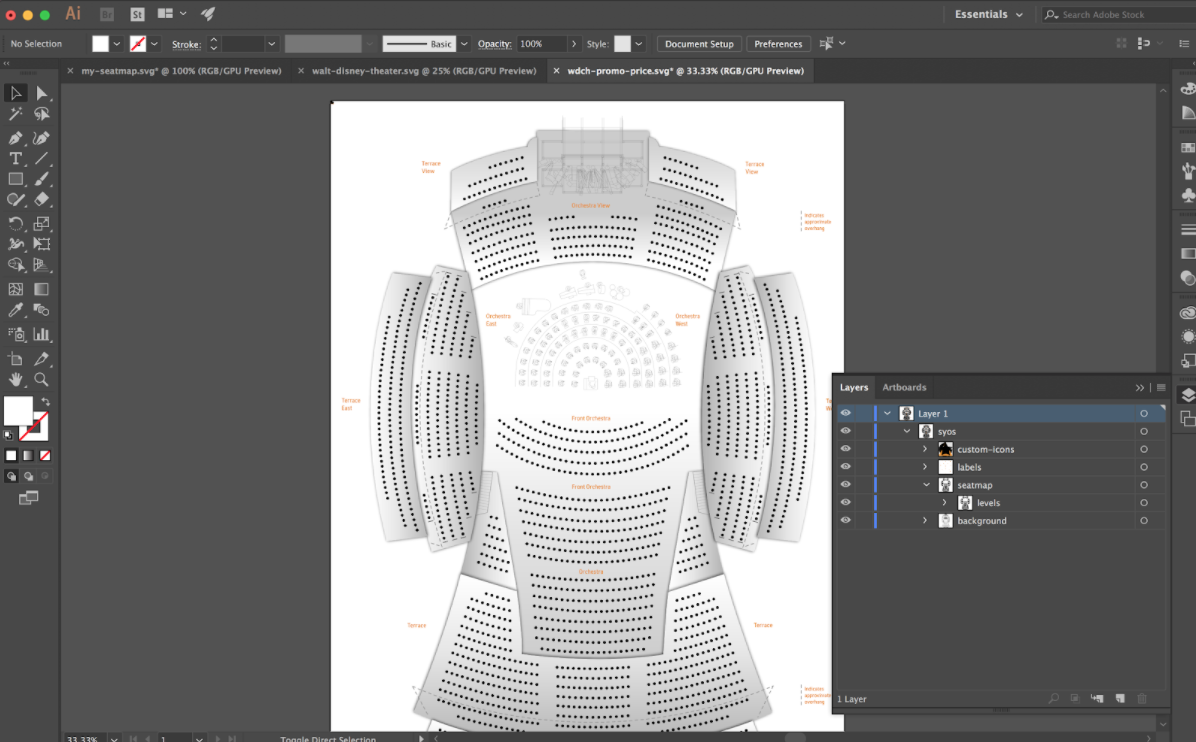
Once you’ve gone through the process of creating your seat-map graphic and moving all the seats into their correct locations (well done!) then you should have something like the following and be ready to export your new seat-map.
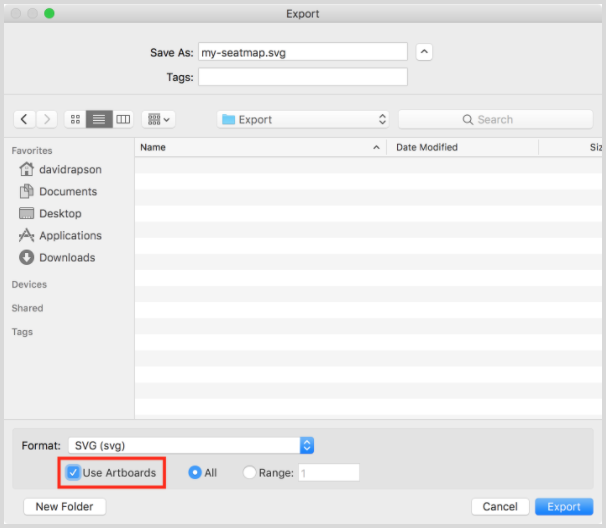
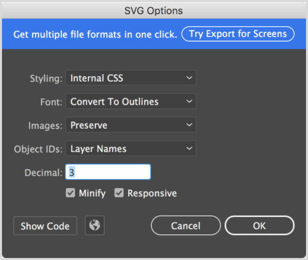
From here make sure you check the Use Artboards” option when exporting and make sure that “Minify” is selected in the SVG Options dialog.
Note: Once you’ve exported the SVG you will need to open the SVG in a text editor and remove the <title> attribute otherwise it will appear as a tooltip, which can be annoying.
Configuring Facility Mappings
To tell the application about your new seat-map graphic you’ll need to configure it. This is done through the facilityMapping config as part of the global config.
window.SYOSConfig = {
  …
  facilityMapping: [{
    facility_no: 122,
    svg: '/path/to/seatmap.svg'
  }]
}
The facilityMapping config accepts an array of possible seat-maps. Each seat-map graphic is mapped to a Tessitura facility ID so you will need to
You will also need to make sure that a facility ID is being passed through to the constructor when running the application. This is used to match the active facility up with possible seat-map graphics. If one can’t be found then the application will default to the generated seat-map graphic.
var syosApp = new SYOS({
  initialPerfNo: 1111,
  initialFacilityNo: 123,
  endpoint: 'https://example.com/proxy',
  onComplete: function() {
    console.log('Success!');
  }
});
Custom Seat Icons
As well as the main seat-map graphic we also use the Illustrator source file to handle custom seat icons. These are commonly used for things like ADA seating, or partial view seating but can be used for any use-case where a unique icon adds value.
Structuring Custom Seat Icons
To set up custom icons you need to create a layer called “custom-icons” at the second-level of your Illustrator file to house your custom icon options.
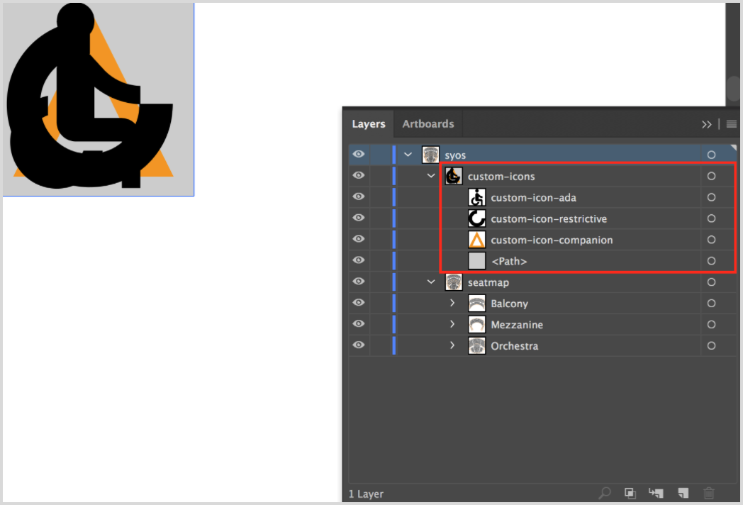
It’s important to note that this custom icons layer must be placed exactly in the top-left corner of your Illustrator file otherwise the icons won’t work.
Individual icons must be single paths and be named like a HTML ID, i.e. no spaces or special characters. Icons should be created at a similar size to the regular seats, although it’s often necessary to create them slightly larger in order for them to appear optically balanced with the rest of the seat, so use your best judgement here.
For this reason, and in order to make it easier to ensure icons are placed exactly in the top left we recommend placing a guide square underneath your icons to help you center them as shown in the screenshot above. This guide element will be hidden when the seat-map is used on the page so don’t worry about deleting it.
Configuring Custom Seat Icons
To use your custom seat icons you need to configure customTypes as part of the global config.
window.SYOSConfig = {
  …
  seatTypes: {
    customTypes: [{
      label: 'ADA',
      slug: 'accessible',
      method: 'custom',
      customName: 'custom-icon-ada',
      holdCodes: [36],
      seatTypeIds: [8]
    }, {
      label: 'Restricted View',
      slug: 'obstructed',
      method: 'custom',
      customName: 'custom-icon-restrictive',
      holdCodes: [34],
      seatTypeIds: []
    }]
  }
}
For each custom icon we require a few pieces of information to determine when to use them.
- “label” is the label shown in the seat-key.
- “slug” is a short ID added to the element, useful for styling.
- “method” should always be “custom”
- “customName” needs to match the layer name of the icon in your Illustrator file.
- Icons can then be associated with one or more hold-code and/or seat-type IDs via the “holdCodes” and “seatTypeIds” options. This is what we use to determine when an icon is shown. In case of conflict we prefer hold-code over seat-type.
You will also need to add a customIconSize property to the facilityMapping to ensure custom icons are displayed correctly. The size should match up with the pixel size of your custom icon guide shape within the Illustrator file. So if your icons are within a 24px bounding box you should set the customIconSize to 24.
window.SYOSConfig = {
  …
  facilityMapping: [{
    facility_no: 122,
    svg: '/path/to/seatmap.svg',
    customIconSize: 24
  }]
}
Creating A Level Selector Graphic
SeatCurve optionally allows you to configure a level selector screen. This screen displays a graphic with a set of hit-areas which allow visitors to pre-select a section of the seat-map to jump to. It also provides a way to establish a sense-of-place within the venue through imagery.
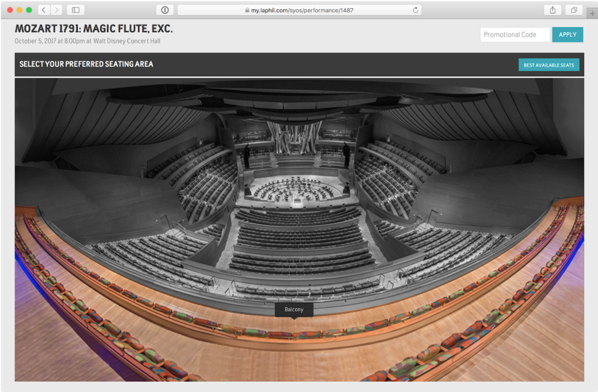
The level selector works by displaying a foreground JPEG image (typically grayscale / desaturated) and a background JPEG image (typically full colour / saturated) and overlaying an SVG which is used as a mask to essentially “poke holes” in the foreground graphic to create hit areas.
You are required to supply the following graphics:
Foreground / default-state graphic
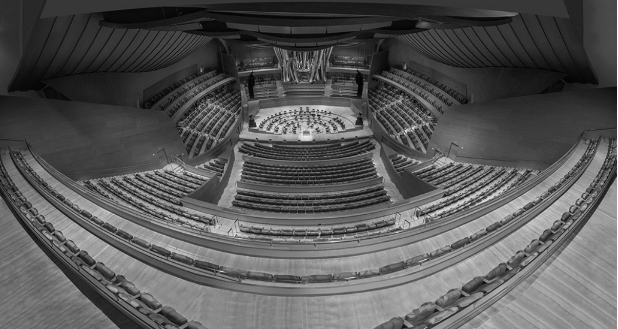
This image should typically be desaturated or vignetted as it is used for the inactive state when hovering over a hit-area. Some trial and error may be required but you are aiming for noticeable contrast between this and the highlight image.
Background / highlight-state graphic
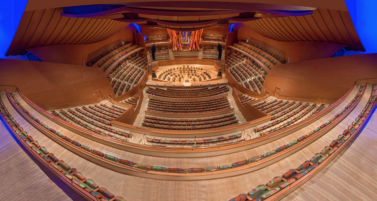
This image should typically be full-colour or even over-saturated as it is used for the active state when hovering over a hit-area. Again, some trial and error may be required, but you are aiming for noticeable contrast between this and the default image.
Hit-area SVG
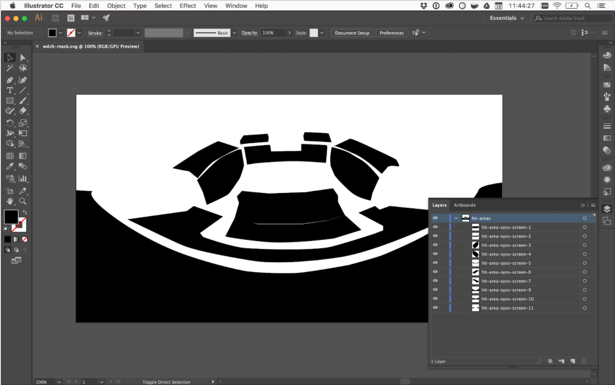
For the hit-area SVG you will need a vector editing application like Adobe Illustrator.
The document canvas must be the same aspect ratio as the images you are using for the level selector. We recommend setting up the document at the same size as the bitmap graphic and import the bitmap graphic into illustrator and use it to trace your hit-areas. Don’t forget to delete the guide bitmap before outputting the file as an SVG.
For each element you’d like to make a hit-area for, you need to draw a single flat path to cover the desired area. The naming conventions for the hit-area SVG are as follows: Your top-level layer should be called “hit-areas”. Individual hit-area paths should be named “hit-area-” and then the ID of the layer you want to link to in the seat-map graphic.
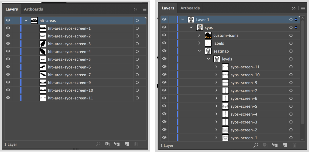
The image on the left is a hit-area graphic and the image on the right is a seat-map graphic. In this case the path labelled “hit-area-syos-screen-1” maps to the layer “syos-screen-1” in the actual seat-map.
The layers you link to in the seat-map are arbitrary so you can group seats in whatever way makes sense. Typically this might be the screen (as in the example above) but you can group seats however makes sense for the venue you are working on.
Once you are ready to export your hit-areas SVG from Illustrator choose “File > Export as…”.
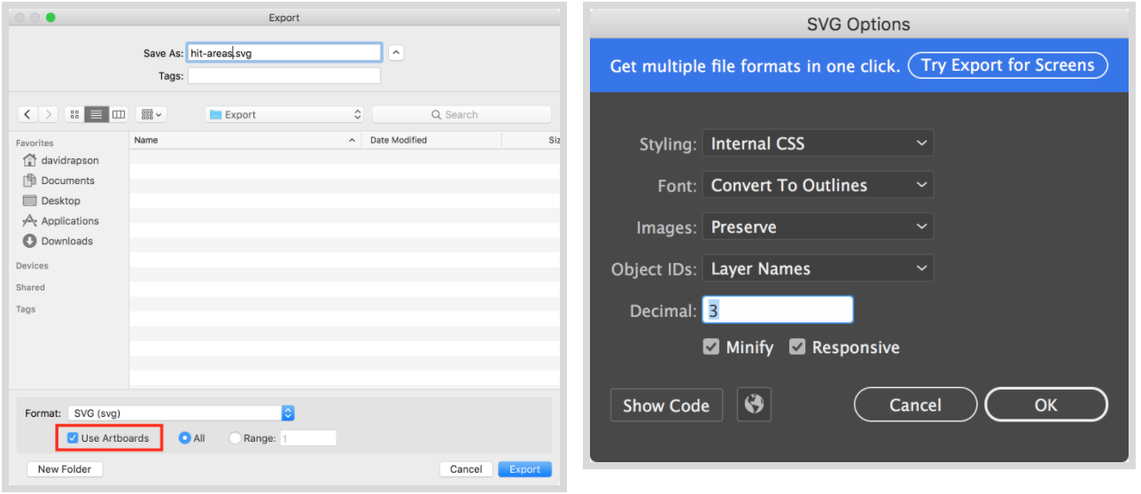
From here make sure you check the “Use Artboards” option when exporting and make sure that “Minify” is selected in the SVG Options dialog.
Configuring The Level Selector
After following the steps above you should have three files: foreground.jpg. background.jpg, and mask.svg. Once you have these assets you’ll need to tell the application about them. You’ll need to do the following:
- Enable the levelSelector feature flag
- Configure the level selector in the facilityMapping config.
The facility mapping options look like the following:
window.SYOSConfig = {
  …
  facilityMapping: [
    {
      facility_no: 12,
      svg: 'path/to/seatmap.svg',
      customIconSize: 12,

      levelSelector: {
        imageBackground: '/path/tobackground.jpg',
        imageForeground: '/path/toforeground.jpg',
        imageMask: '/path/to/mask.svg',

        // What zoom level to use when selecting a hit-area
        zoomLevel: 4,

        // Provide labels for each hit-area
        hitAreaLabels: [
          {
            id: 'hit-area-example-1',
            label: 'Front Orchestra'
          }
        ]
      }
    }
  ]
};